Brigstow Institute Brand Refresh
University of Bristol, Brigstow Institute
The Brigstow Institute is a University of Bristol research institute, bridging the gap between academia and social groups to explore and find interventions to help people live better. Back in 2016 Green Hat worked with the Brigstow Institute to create their styling (see this project here). Now, 7 years on Brigstow Institute has evolved and they tasked us with designing a new look to reflect this.
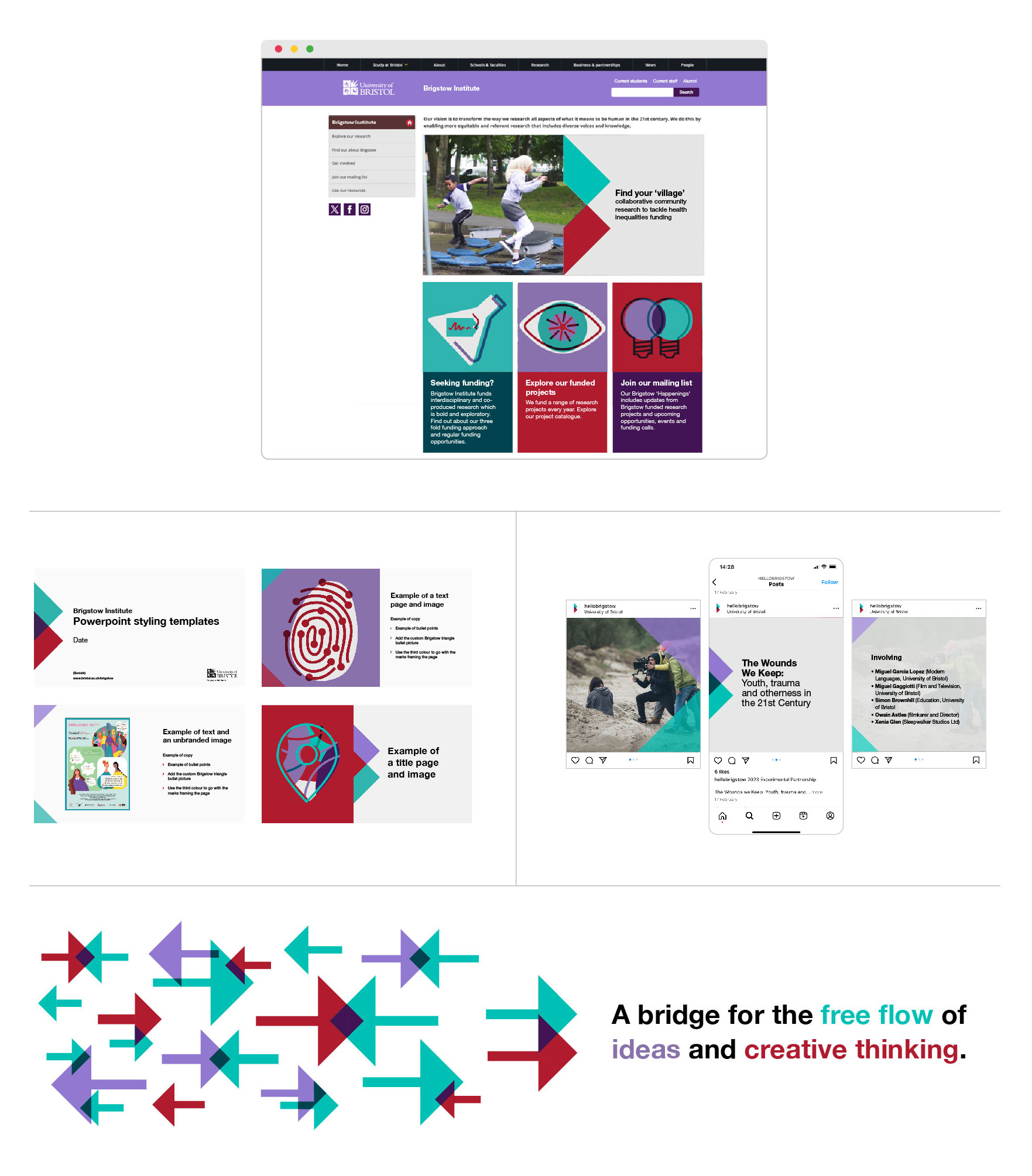
We were asked us to refresh the style, showing how the Institute’s grown whilst retaining its playfulness. Brigstow also wanted to bring back the meaning behind their name: ‘meeting place by the bridge’. The styling needed to be versatile to suit a variety of communications across digital and printed media.
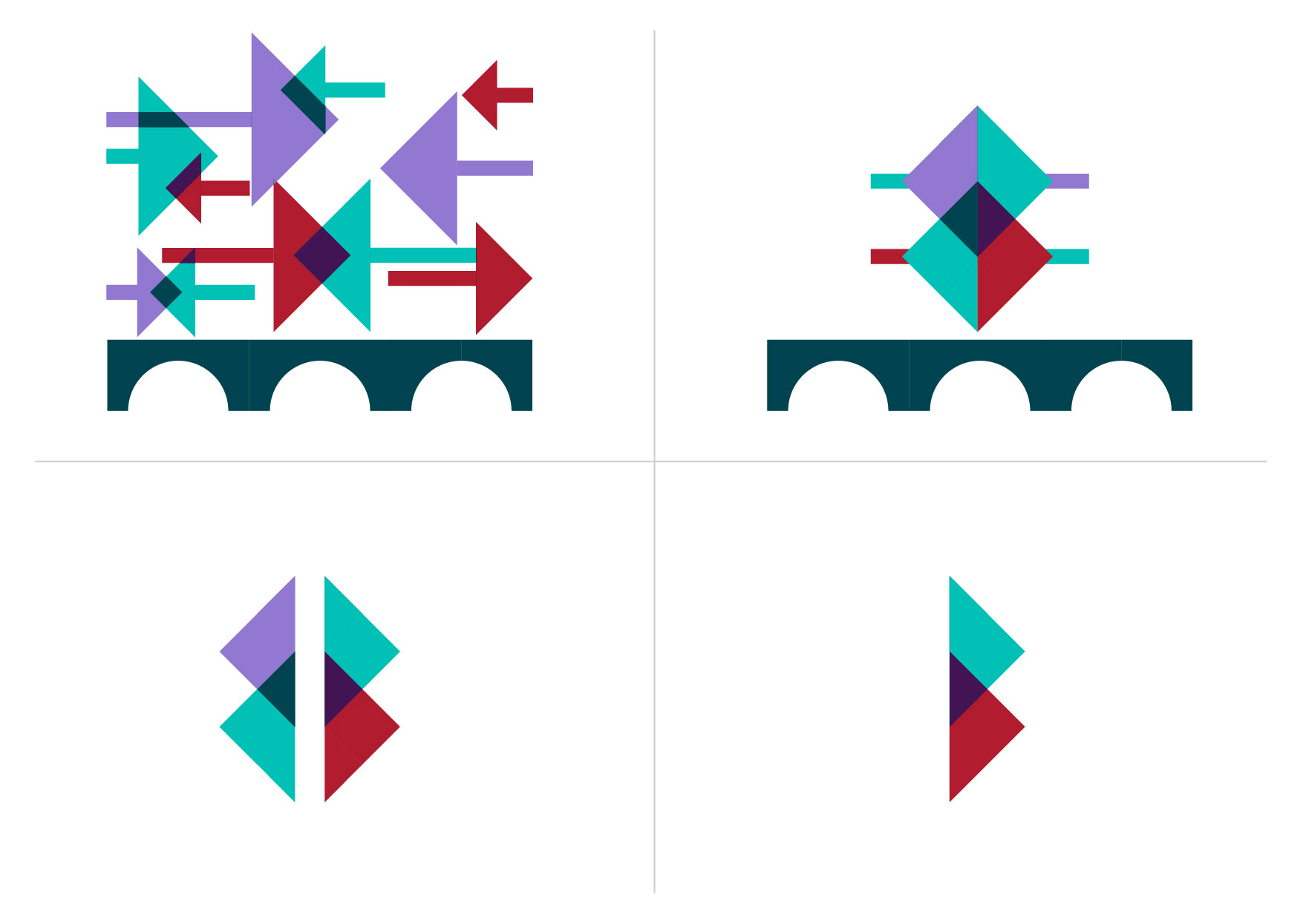
We focused on the core concept of the Brigstow Institute as a meeting place for ideas: they provide the support to bring researchers and partners together to create something new. This is represented by the crossover of two colours to create a third. The shape of the ideas coming together creates a B, the Brigstow ‘B’. This B can be applied in three variations to cover the three different areas of communications: projects, questions and people.
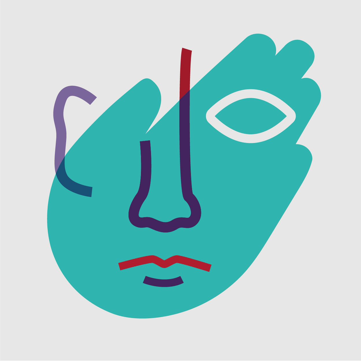
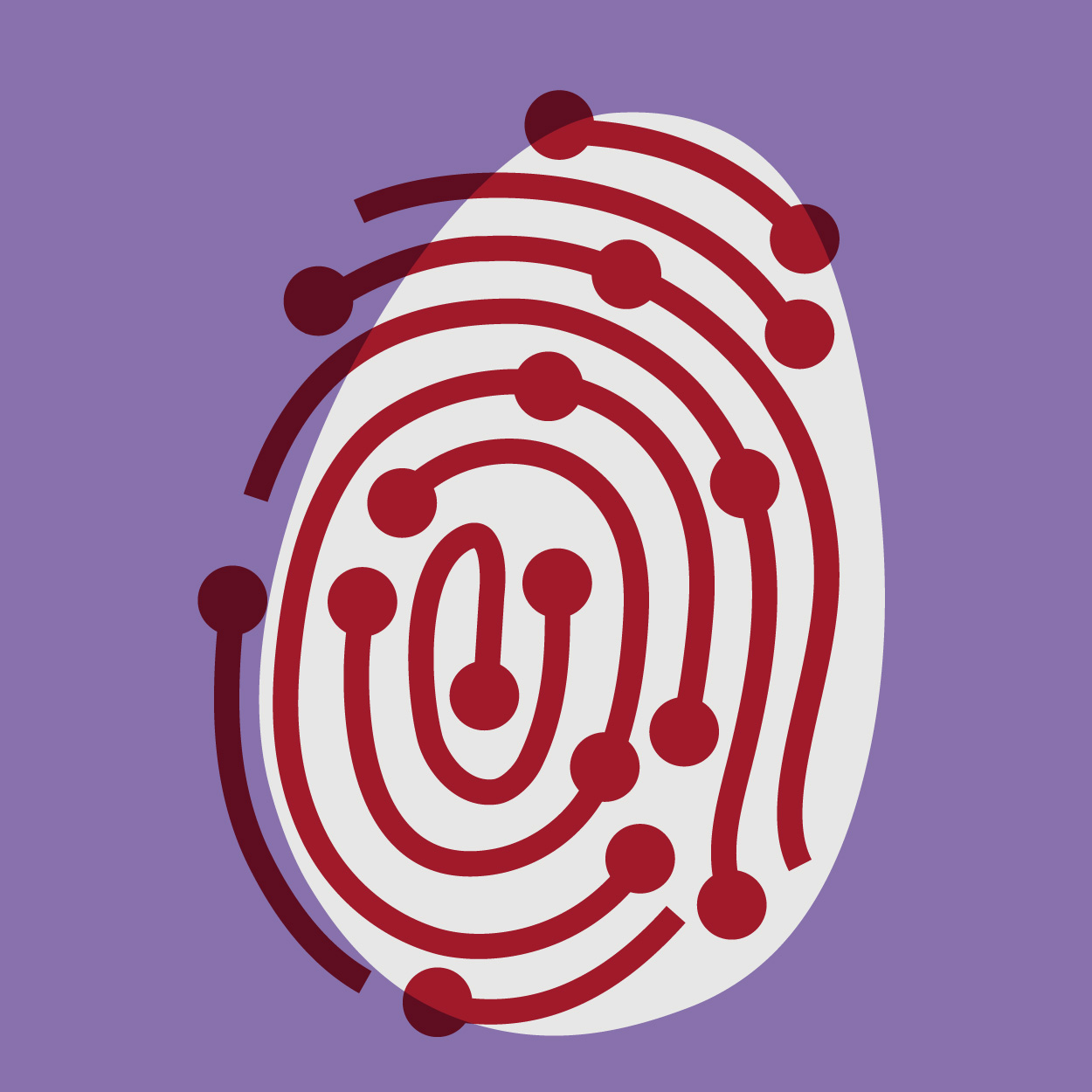
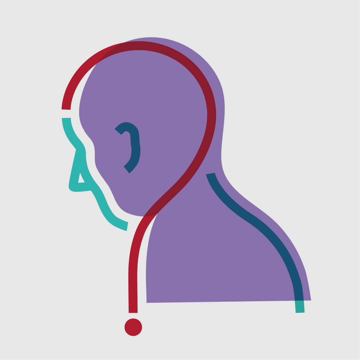
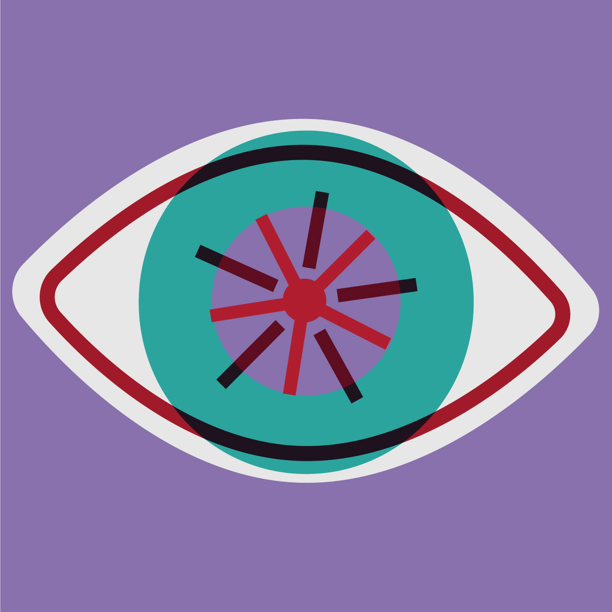
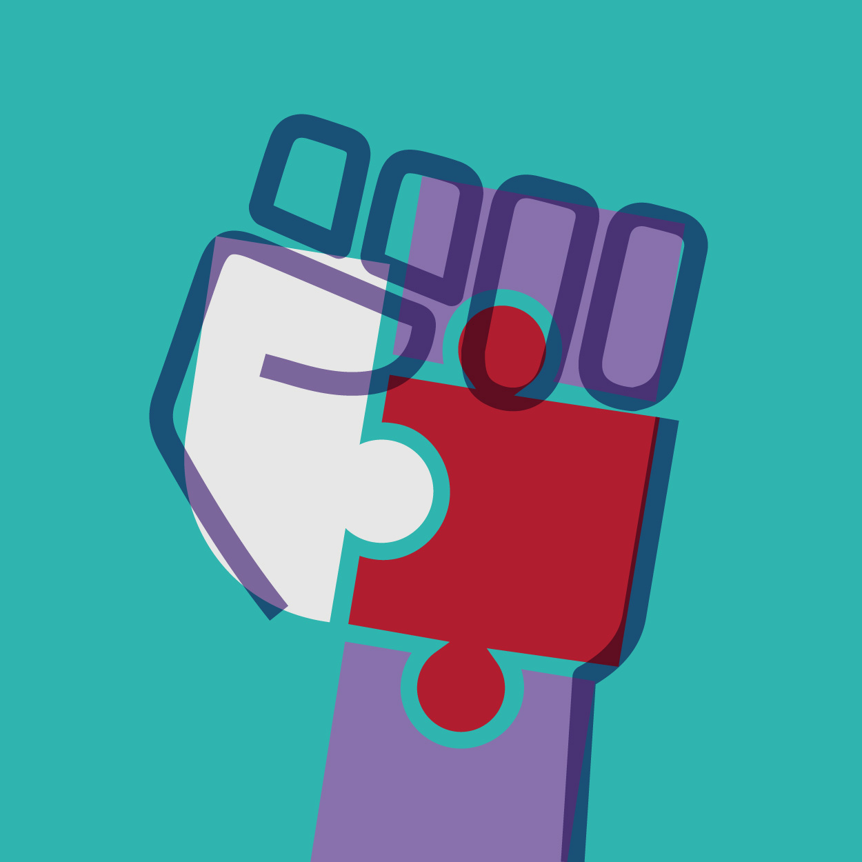
We also looked at updating the Brigstow illustration style. Previously they had a hand drawn quality that could be interpreted as childish. To evolve the style we created the illustrations as solid vectors, with overlapping line work to reference the concept of ideas coming together. As part of the refresh we developed a suite of new illustrations to represent the different themes of Brigstow: Senses of Life, More than Human, Marking Time, Creatively Curious, Hidden Losses, Critical Making, Action and Activism and Bridging Divides.